

Beauty
Play
Brand Identity | Social Media | Print & Marketing Material | Membership Card Design | Brand Guidelines
Beauty Play was created to make makeup feel approachable rather than intimidating. The identity needed to balance the energy of modern beauty brands with the warmth of an educational space where people could experiment, learn and build confidence.
The Challenge:
-
Create a beauty brand that feels welcoming and playful without losing polish.
-
Encourage confidence, creativity and self-expression for people at every skill level.
-
Build a flexible identity that works across digital, print and in-store experiences.

01. Challenge


Logo Exploration:
Early concepts explored multiple interpretations of "play," including a dice-inspired icon, makeup palette references, and media play button motifs. Typography was also explored to find a balance between energy, approachability, and modern beauty branding.


While these concepts showed potential, they lacked flexibility across different applications, particularly on darker backgrounds and felt more illustrative than iconic. The next phase focused on a simpler, more scalable direction by exploring monograms built from the B and P.

The final mark merges the B and P into a refined monogram with a subtle tilt that adds playfulness without sacrificing sophistication. The play button became a supporting graphic device, creating a flexible identity system rather than a single standalone logo.
Solution:
the solution:
-
Built a bold identity around a custom B + P monogram inspired by the idea of play.
-
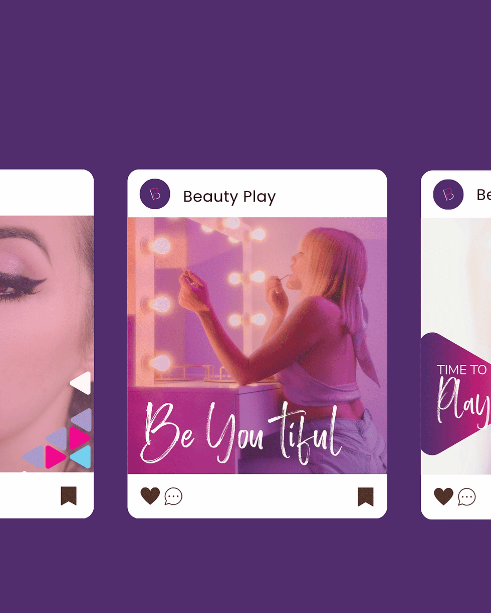
Paired vibrant gradients, expressive type and playful graphics with clean layouts to keep the brand approachable.
-
Extended the identity into a cohesive system across membership, social, print and brand guidelines.
21+
Logo variations explored
14
Color options explored
10+
Social post
templates
02.the solution

Result
The final identity transformed Beauty Play into a brand that feels both playful and polished. By combining expressive typography, vibrant gradients and an approachable visual system, the brand now communicates confidence without intimidation and scales consistently across retail, print, digital and social experiences.
04. The Result